
Thrive Market Brand Refresh
Art Direction | Color Strategy
As an entirely in-house team without agency support, we own every piece of creative at Thrive Market, from promotional to brand. Working alongside our Senior Creative Director, I co-led a refresh of the brand's color system and took full ownership of photography direction, building a new visual language now used across landing pages, paid social, print, and email.
Credits
Senior Creative Director: Sara Khwaja
Creative Director: Matthew Schulert
Art Director: Elisha Knight
Where It Started
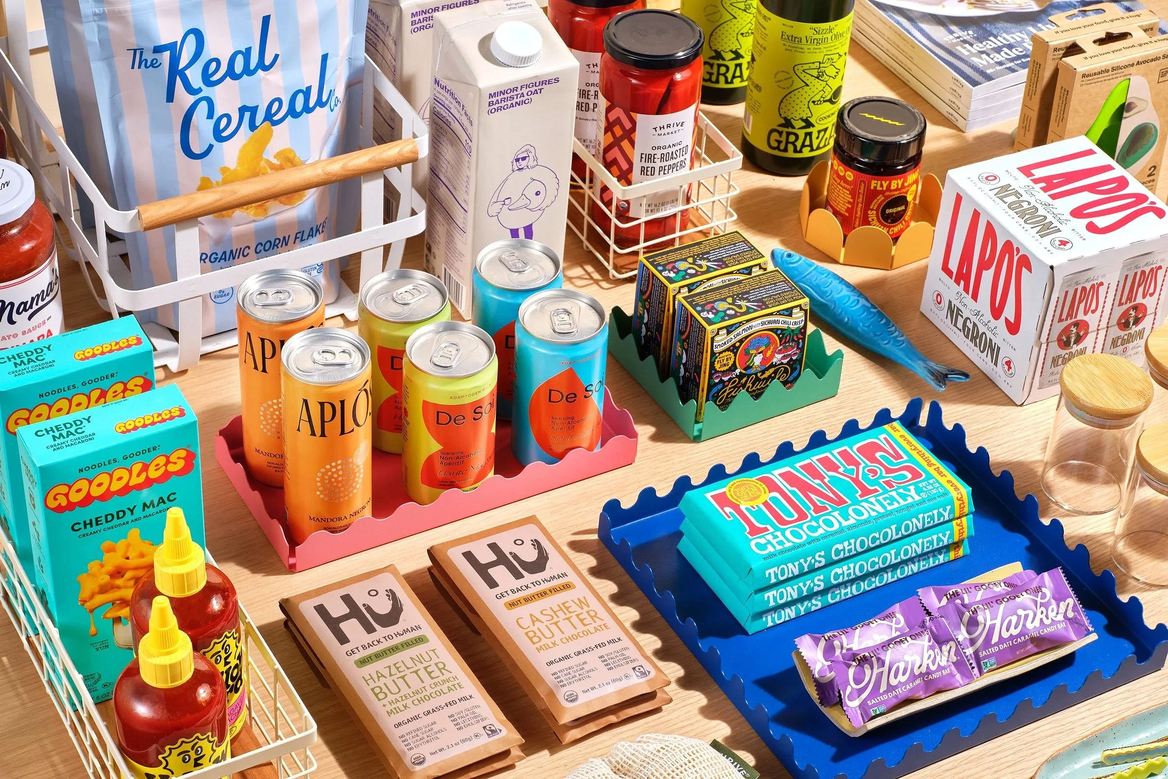
After a period of strong growth, Thrive Market's member retention leveled off. Although new members continued to join, the visual identity no longer reflected what made Thrive unique.
Promotional imagery was frequently used as brand imagery, rarely highlighting Thrive Market's values or products, and making it difficult for members to identify with the brand. The color palette was limited, relying on seasonal colors for variety instead of a cohesive, year-round system, resulting in a fragmented visual identity. We didn’t need a complete overhaul, but we did need a refreshed visual strategy.
The Color Palette
Out With the Old
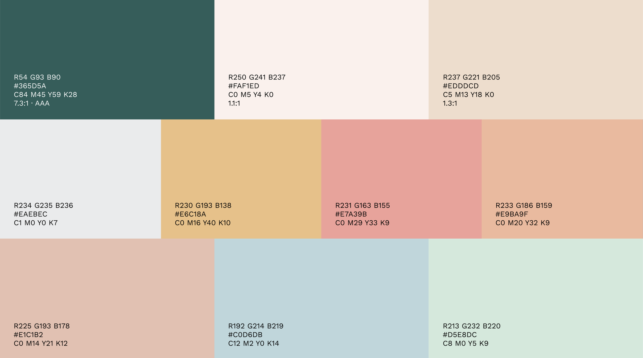
Beyond our primary colors, our palette included various shades of muted yellow and pink. We had such a limited range of colors that, when we needed something bolder or more saturated, we turned to seasonal colors, which disrupted our cohesive brand identity.
In With the New
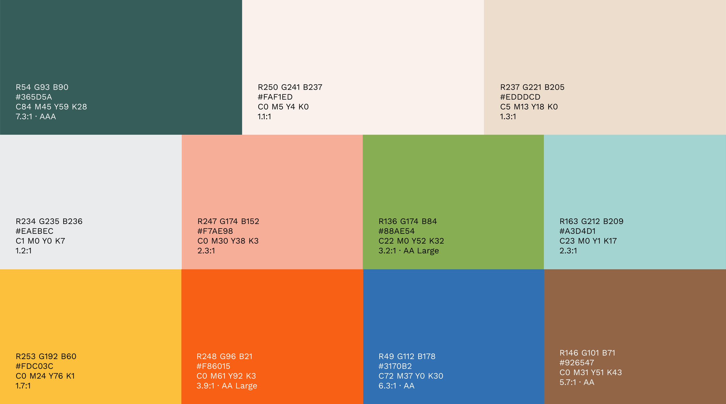
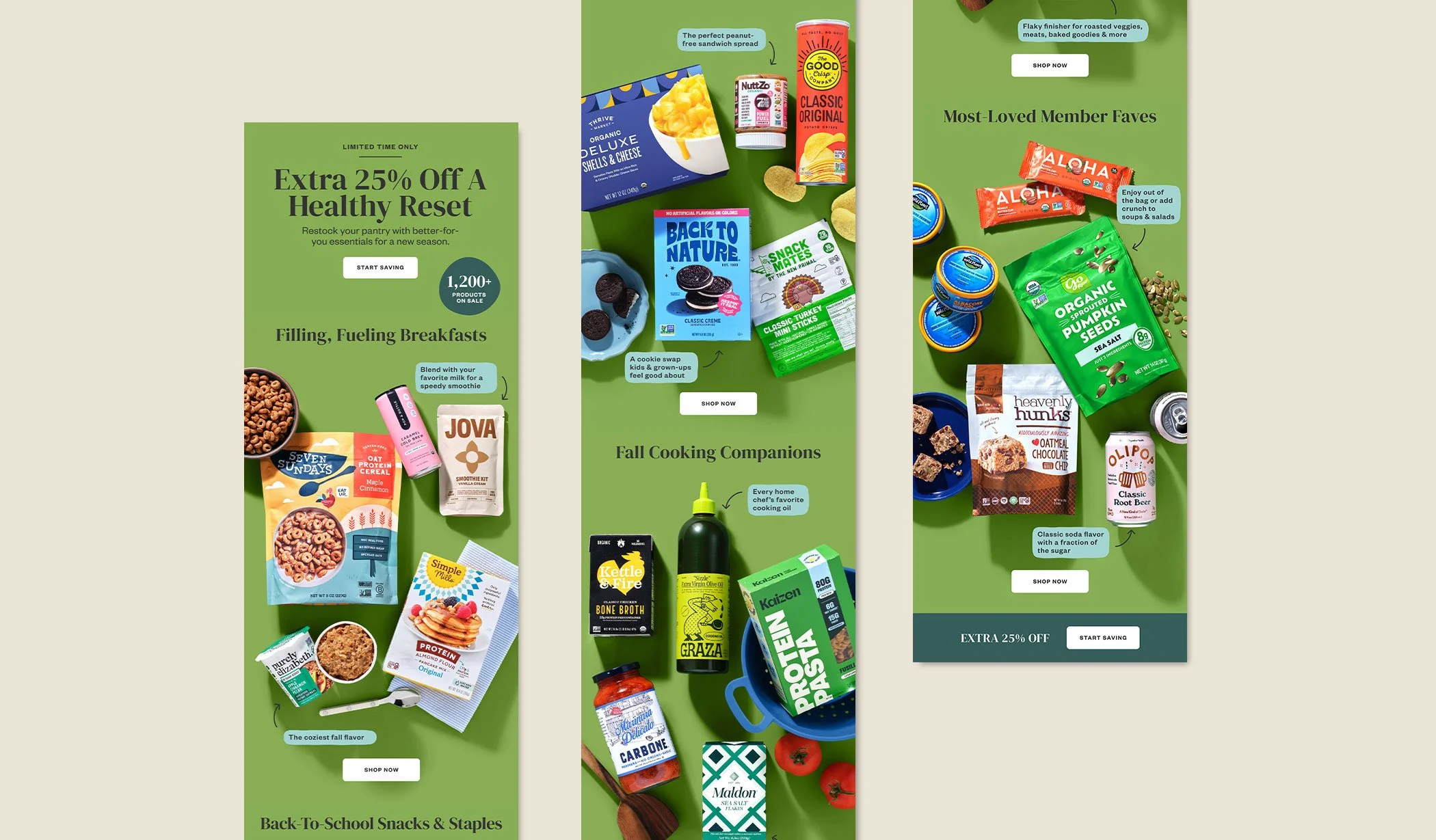
The refreshed palette kept our primary colors intact and expanded into a broader secondary and tertiary range, with bolder, higher-contrast tones built to perform in fast-scroll environments like paid social and CTV. The result is a system with enough depth to carry the brand year-round, with seasonal color now used to complement it rather than carry it alone.

The Photography Direction
Before stepping into art direction, I worked as a photographer and helped establish Thrive's original visual style. This experience informed my approach to the brand refresh.
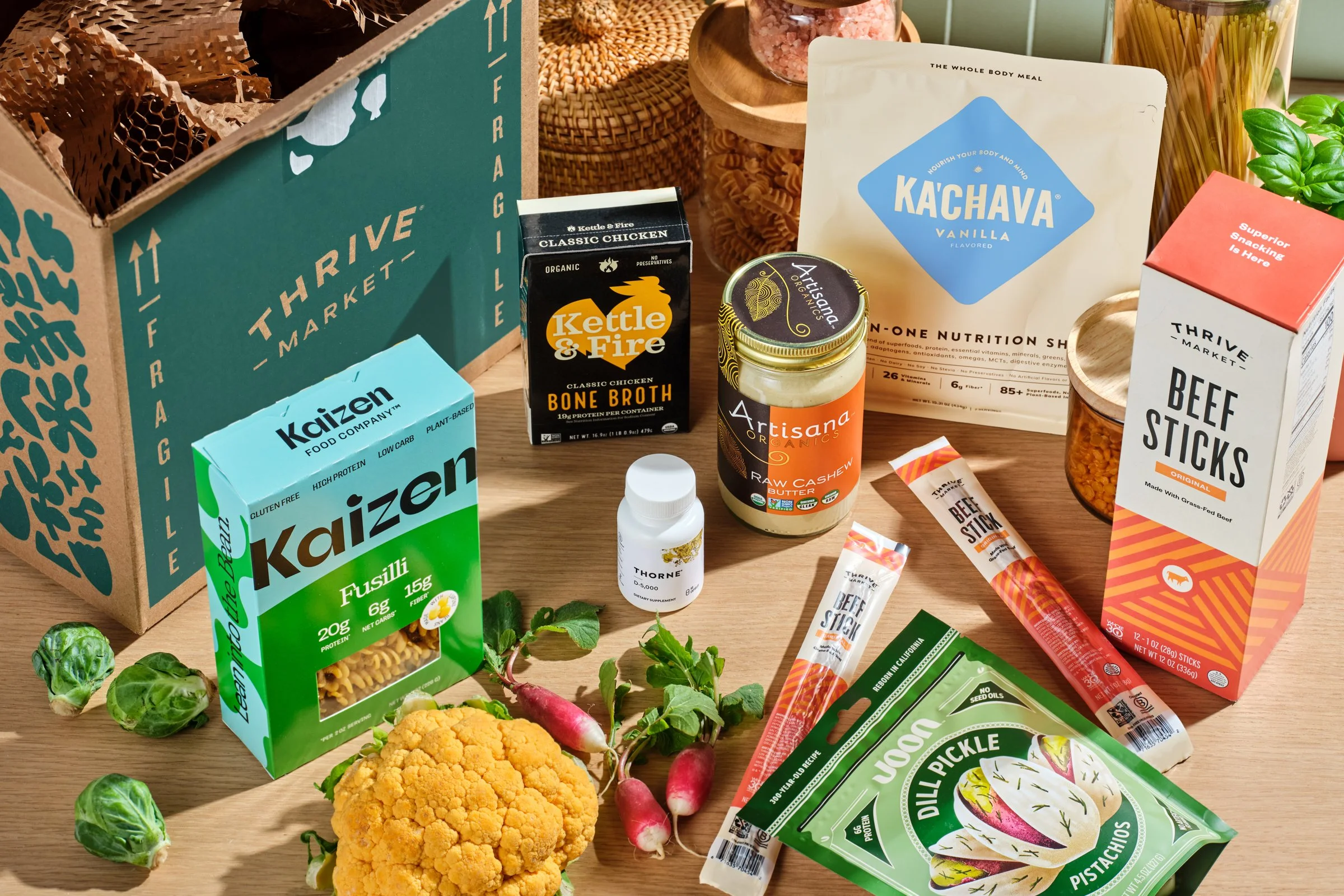
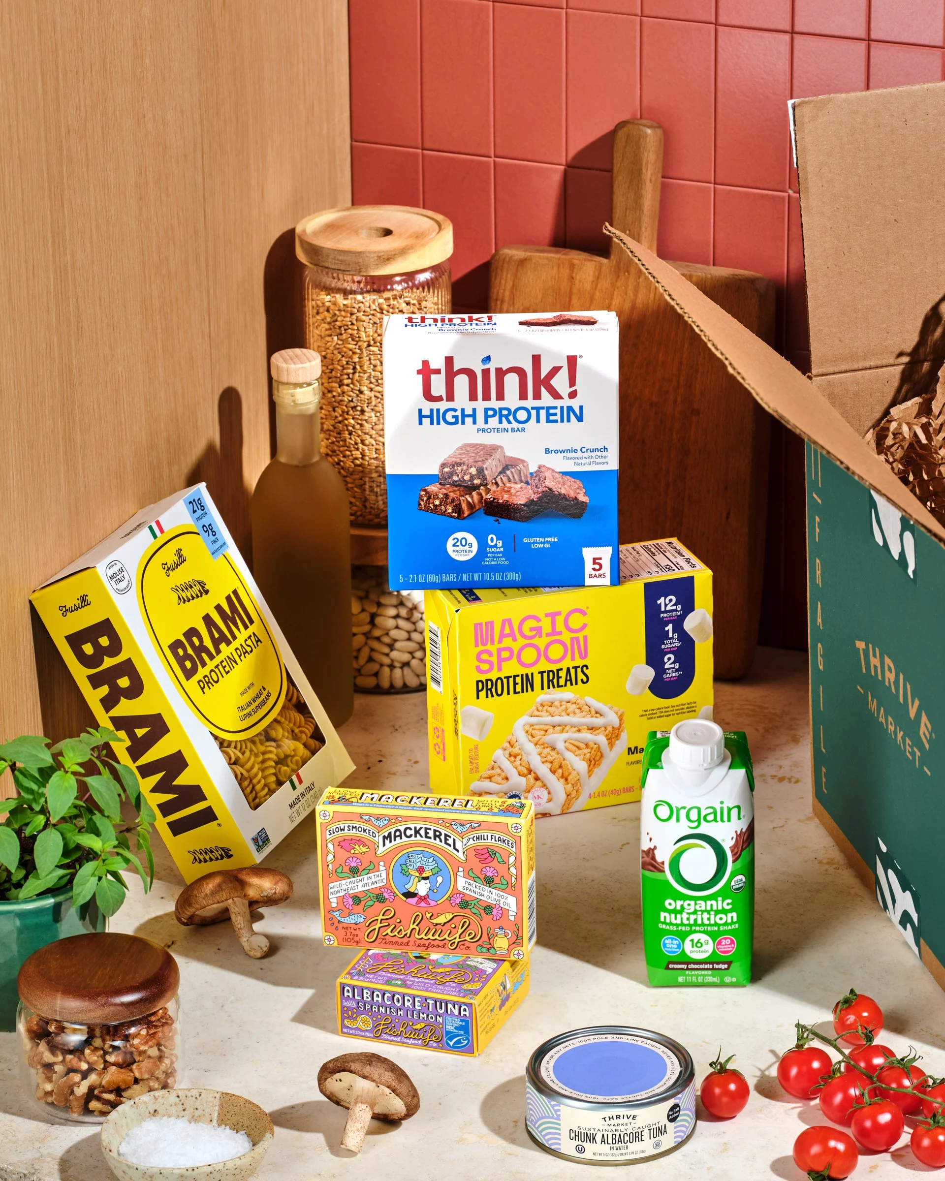
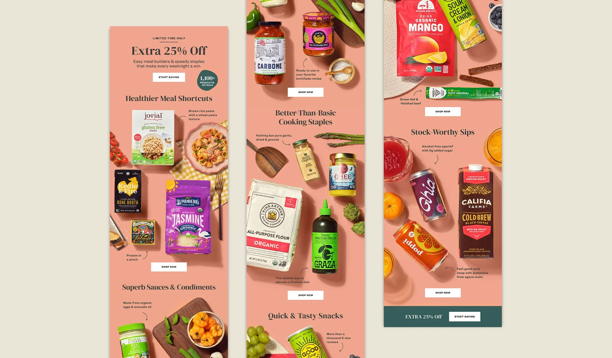
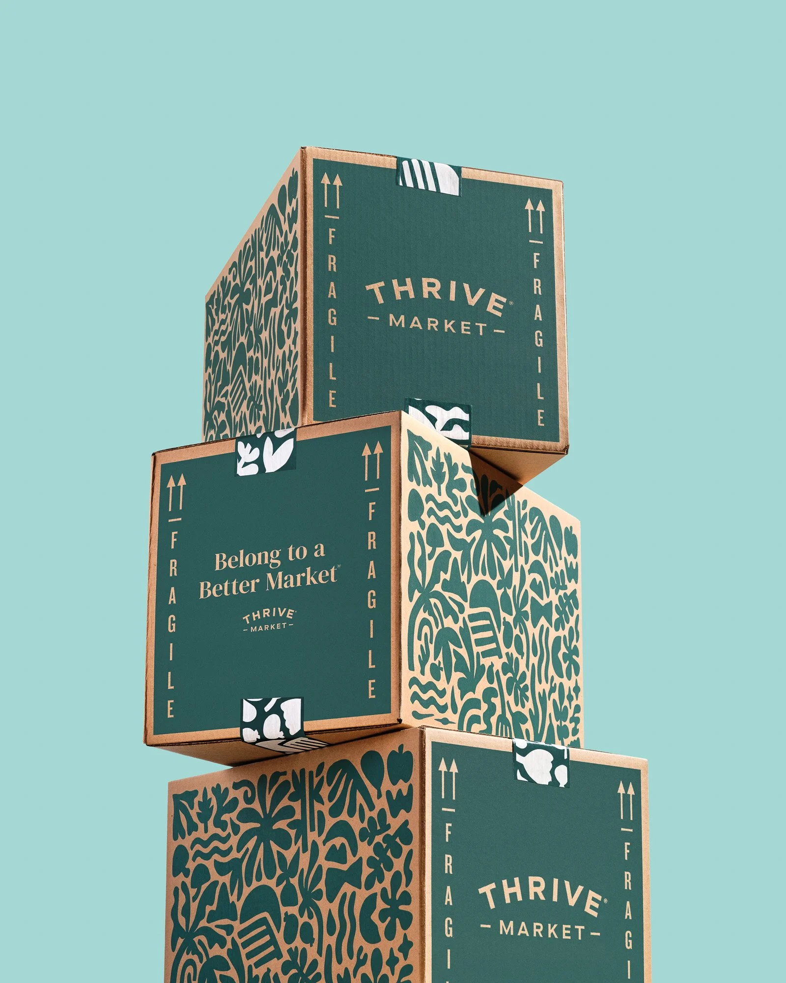
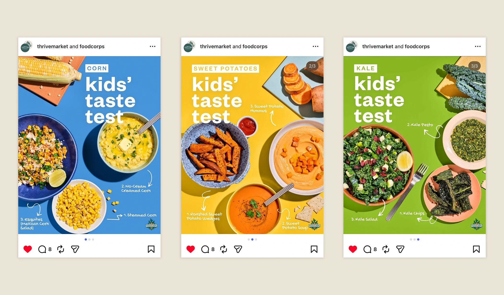
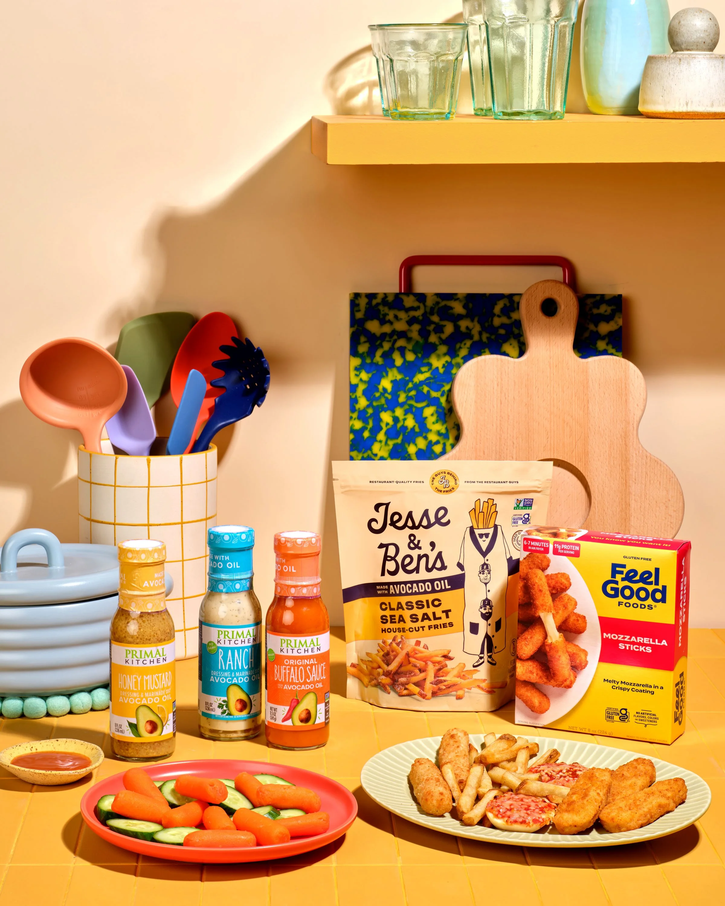
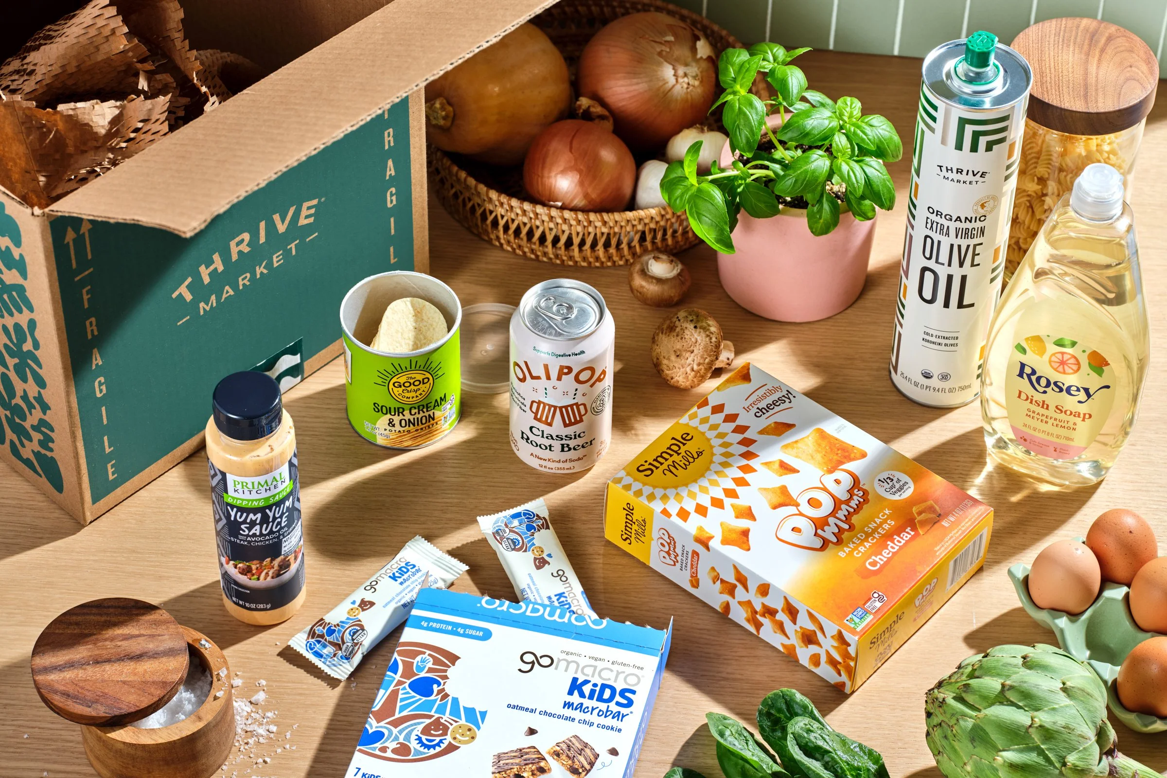
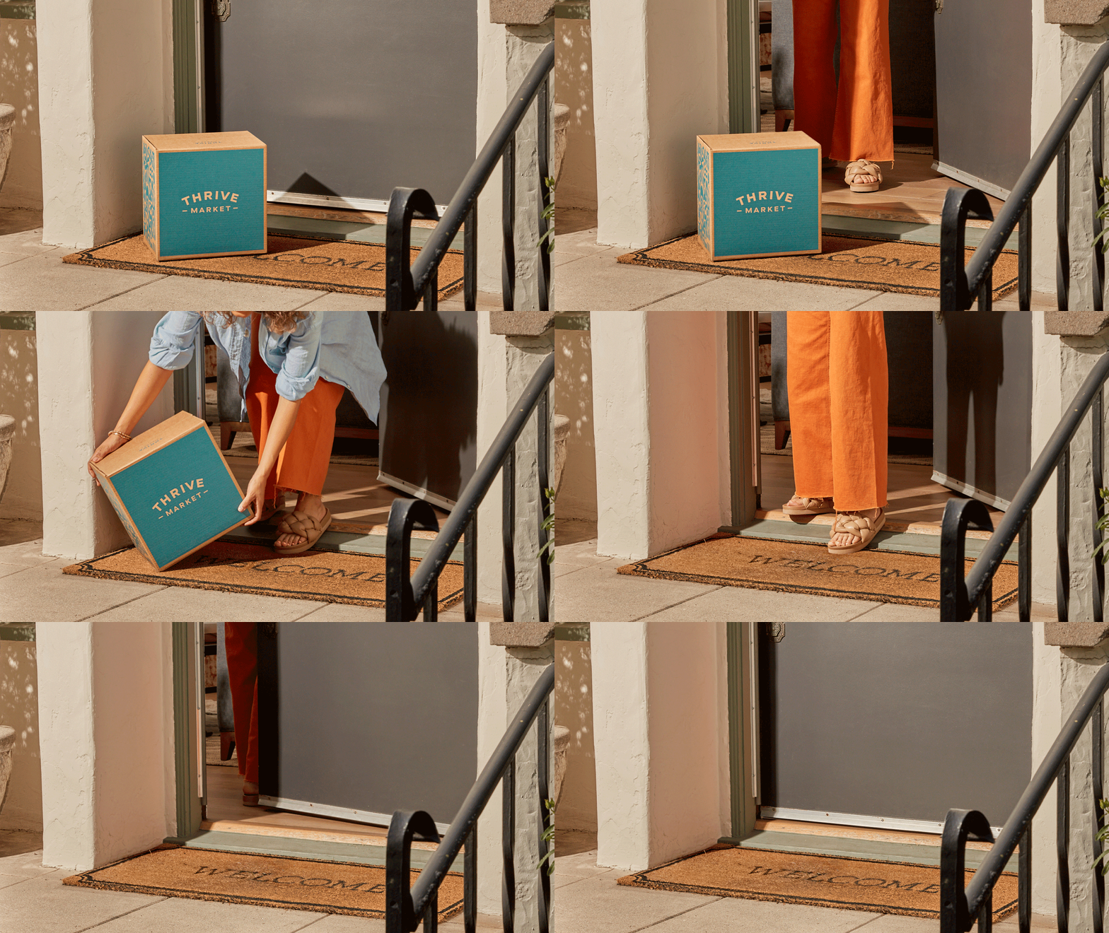
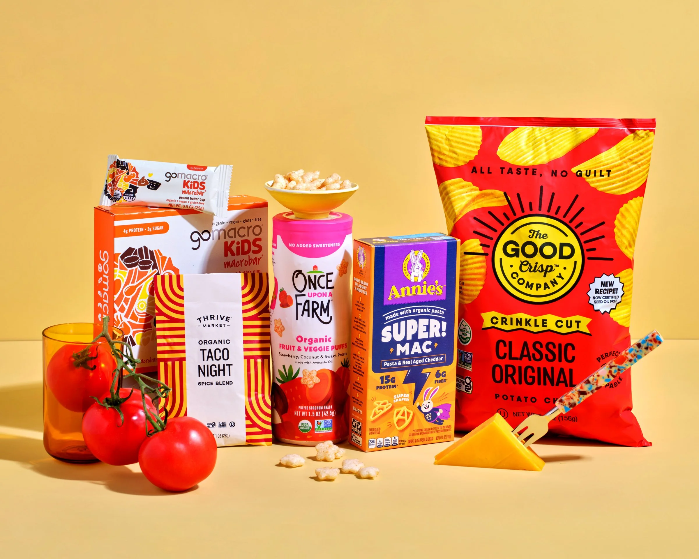
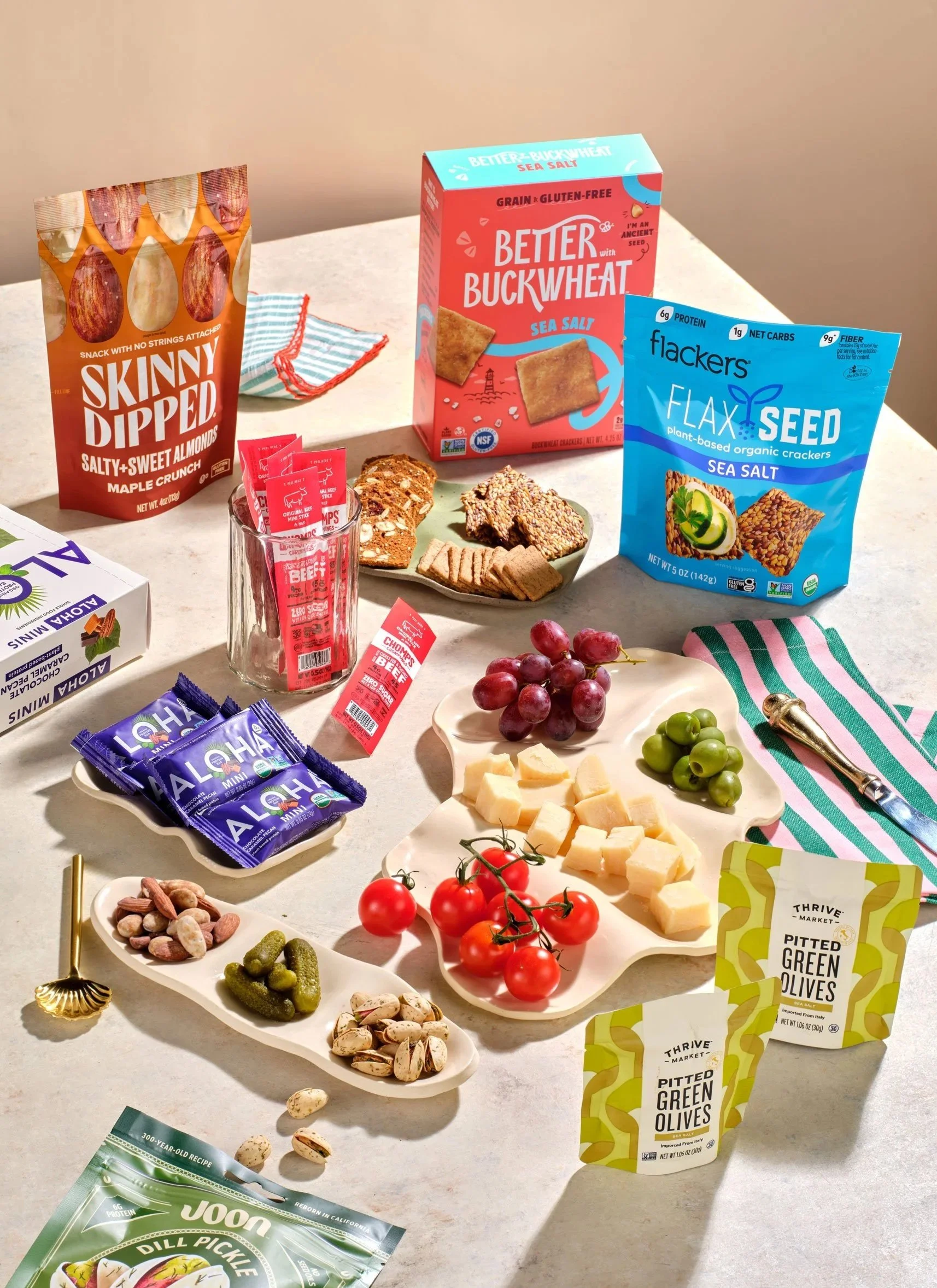
Our lean team operates like an in-house agency, with one and a half photographers (myself filling the half!) We handle everything from PDP shots to brand imagery. Given our limited resources, I prioritized shoots for brand storytelling and high-visibility placements such as sale campaigns, editorial, and onsite banners. This approach created two distinct visual languages: clean, product-focused promotional work and brand photography that emphasizes lifestyle and human context. That direction now shows up everywhere a member encounters the brand, from CRM to their first order box.


How It’s Going
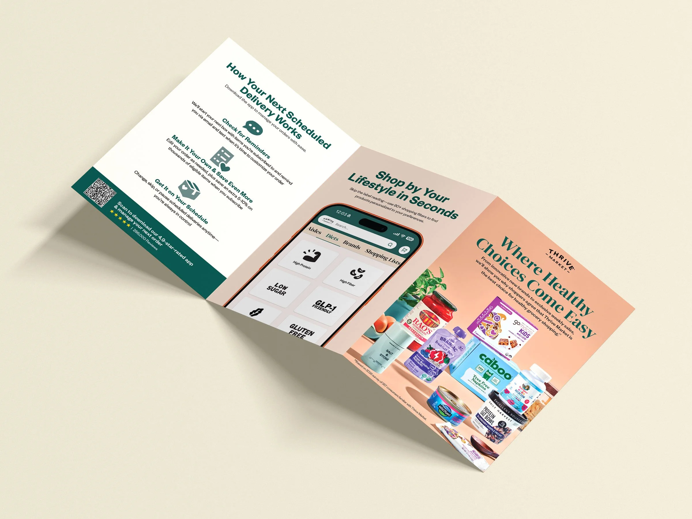
The refreshed color and photography system now lives across Thrive Market's key touchpoints. Promotional materials feature cleaner, more intentional product styling, while brand moments use richer lifestyle imagery. Landing pages are built around the new visual language, and paid social campaigns highlight purposeful, product-focused photography and a more impactful color palette. In print, the member welcome booklet has been redesigned for the first time in three years, introducing the new system to every member's first order.
Teams across UX, paid social, and CRM have adopted the system, demonstrating its practical value beyond a top-down rebrand. Executives and the board reviewed and approved the refresh. I also received a marketing team CMO Award, recognizing how the updated color and photography direction made the brand more relatable for members.
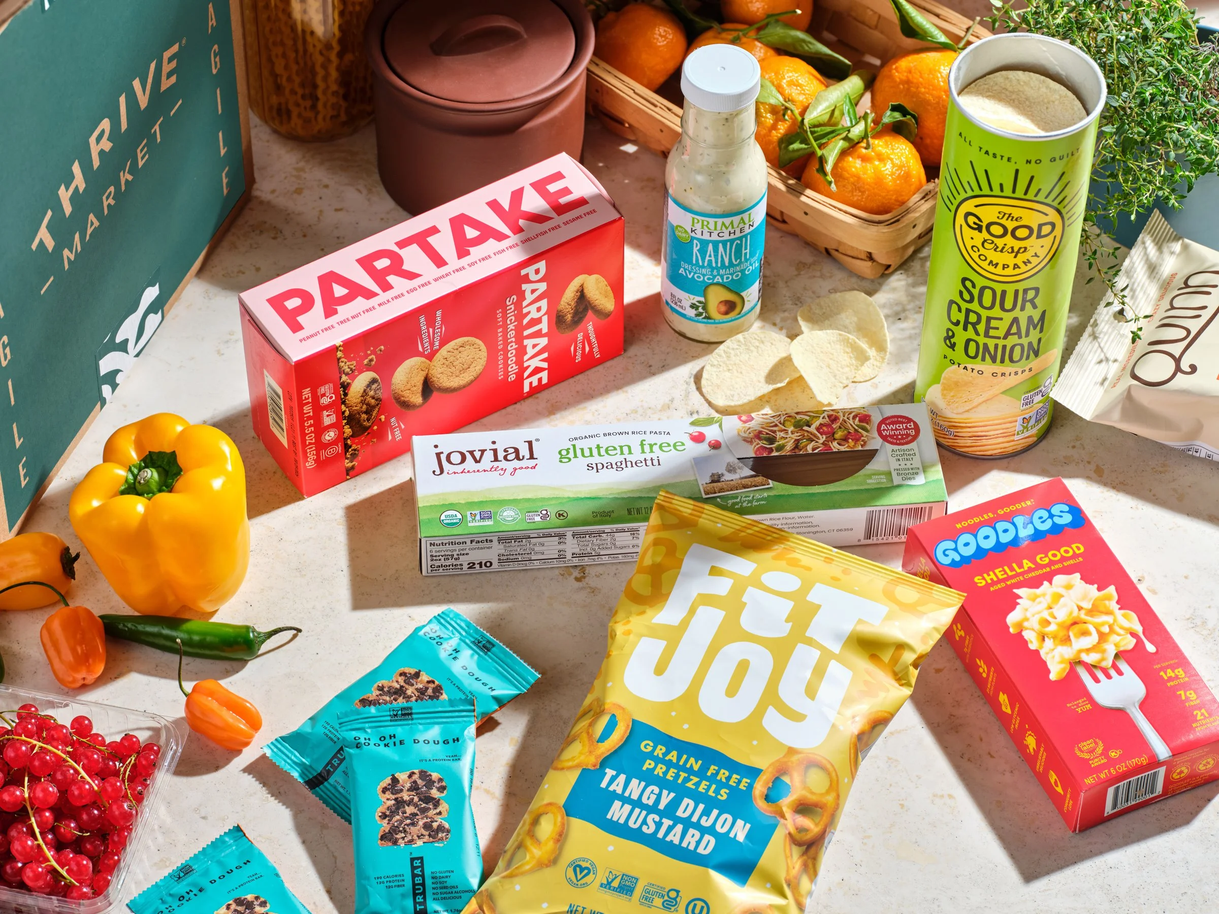
Producer: Jon Kim | Design Director: Jeffrey Chan | Senior Designer: Garrin Yabuta | Photographer: Brittany Moser, Elisha Knight | Stylist: Amy Lipnis and Aimie Vredevoogd | Retouching: Jackie Estay