
At Thrive Market, email is where brand creative meets performance. As Art Director, I lead photography direction, develop seasonal color palettes, and work closely with photographers and stylists to keep the work fresh and consistent. The real challenge isn't making one great email; it's building a visual system that makes every email feel on-brand and worth opening.
Thrive Market
Seasonal Email Campaigns

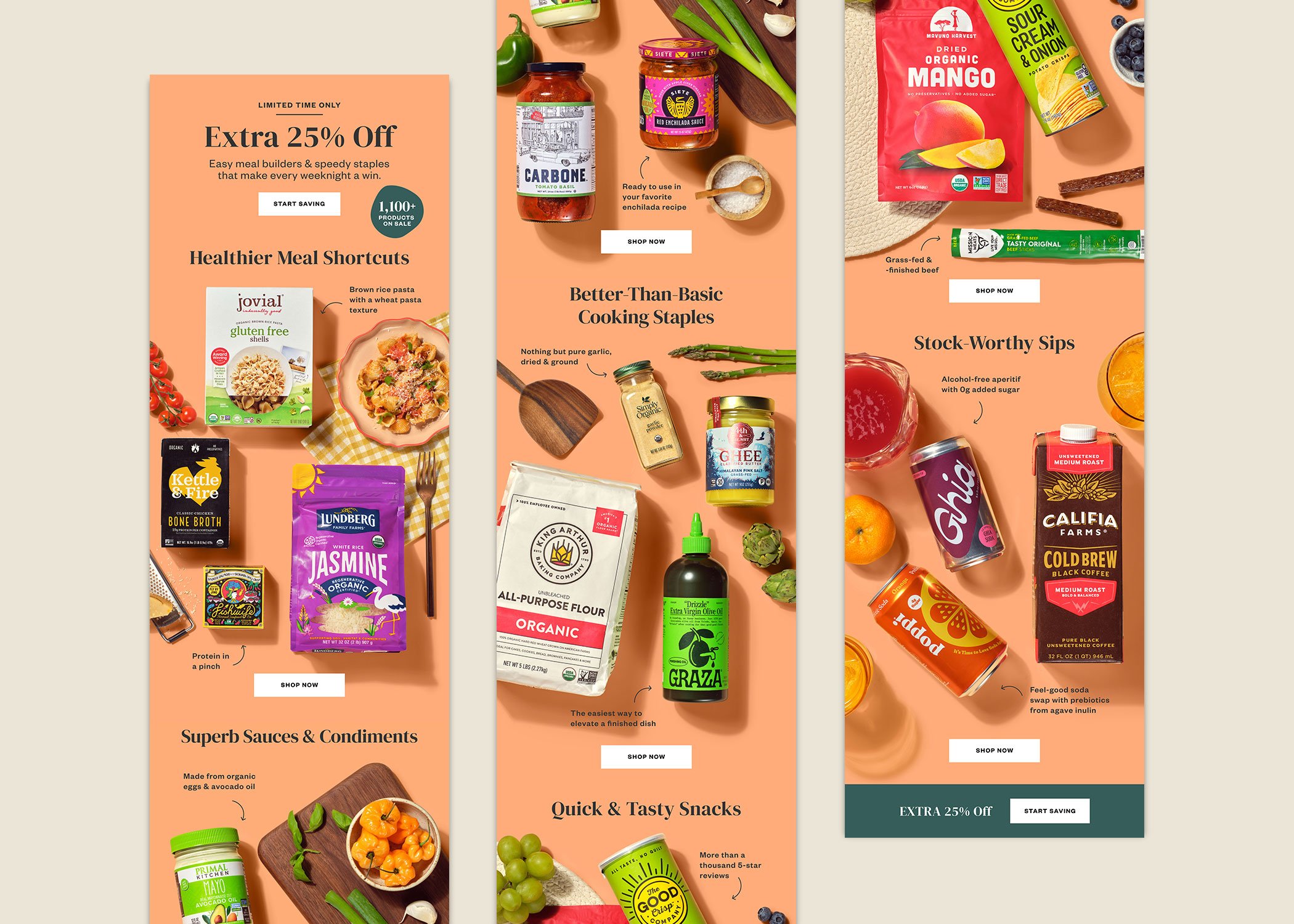
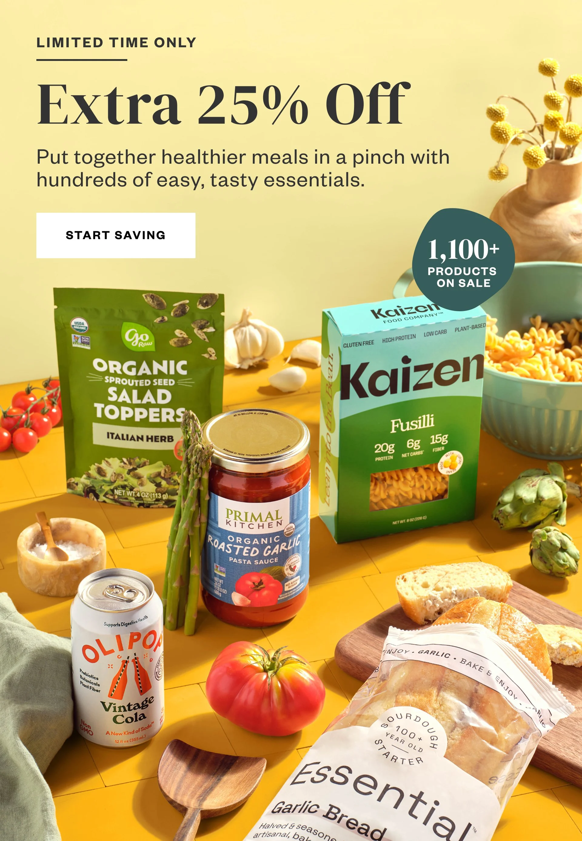
Spring: Pantry Restock
Sunny yellows and peachy oranges, as vibrant extensions of Thrive's core palette, were used consistently to maintain visual cohesion across all touchpoints.

Summer: Thriving Outside
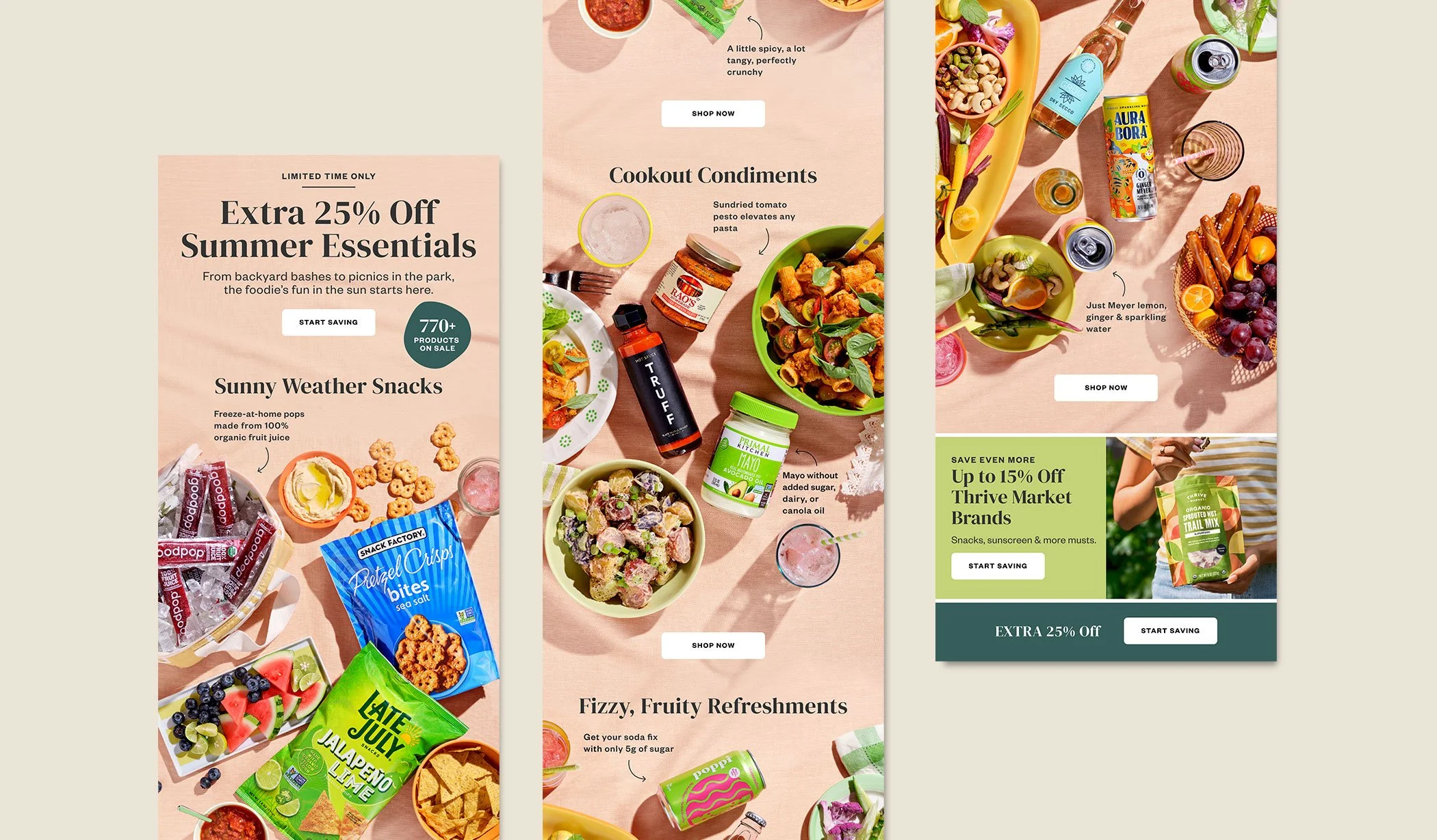
Picnics, cookouts, and everything in between. Fresh greens and warm pinks developed as seasonal complements to Thrive's core palette, with styling that took products outdoors and on the go.


Fall: Holiday Season Prep
Burnt oranges, warm yellows, and sage greens became seasonal complements to Thrive's core palette. Layered product styling and risers added depth and dimension, creating a harvest richness for a high-volume sale season.




Winter: Healthy Reset
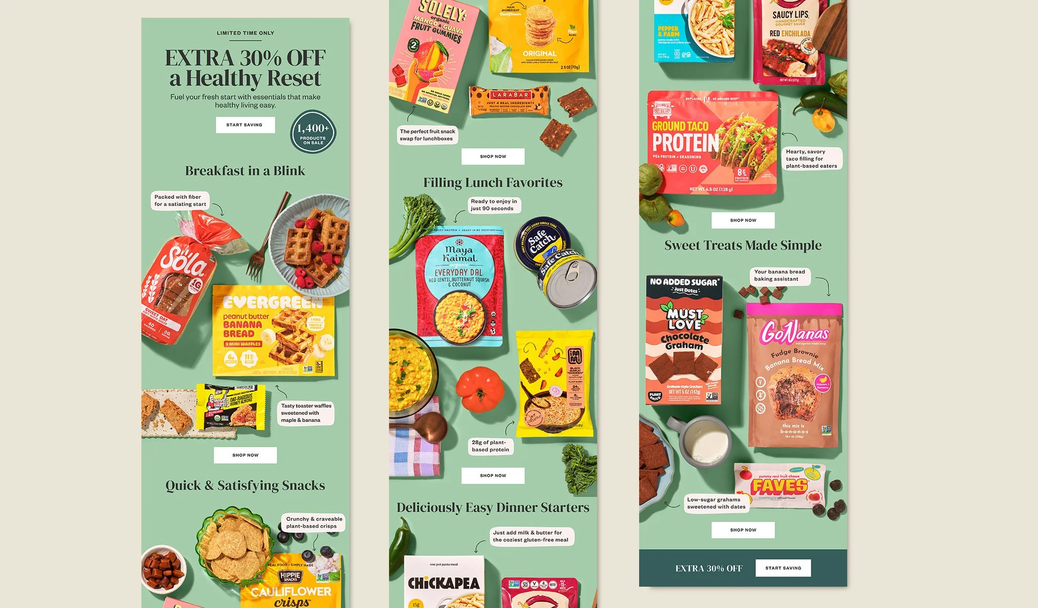
A new year means a fresh start. Dusty teals and sage greens, which add a cool and optimistic touch to Thrive's main colors, set the mood for a campaign focused on smarter habits and better choices. Simple styling kept attention on the products.


Art Director: Elisha Knight | Photography: Brittany Moser | Design: Garrin Yabuta, Jeffrey Chan, Natalia Rehman